
Remembering Y2K Personal Sites
My Personal Site
My site originally launched in 1999 under the very angsty teen name Poison Kindness. It went through four or five layout changes, but sadly, I lost all of my pre-2001 files. And that’s on the importance of backups, kids! The designs weren’t exactly masterpieces, but I really wish I could show you the last one before everything vanished.
It was inspired by the 1986 film Innerspace, with navigation styled like a submarine cockpit. Each link took you to a different part of my bloodstream, creating an entire journey through my body. You’ll just have to take my word for it.
Poison Kindness hopped from host to host as my skills evolved: Hometown AOL, Angelfire.com, Manifest-Angel.com, and Envy.nu. Then, in October 2001, I took the plunge and got my first domain, MandaPop.com, which I still use today.
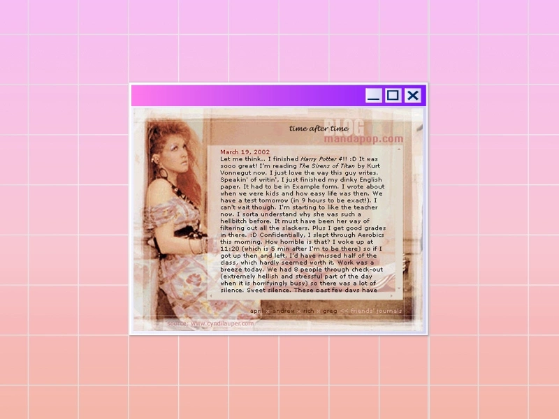
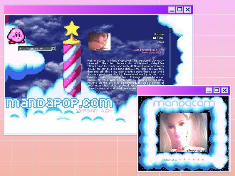
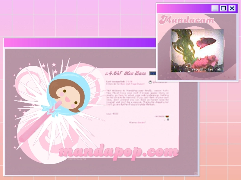
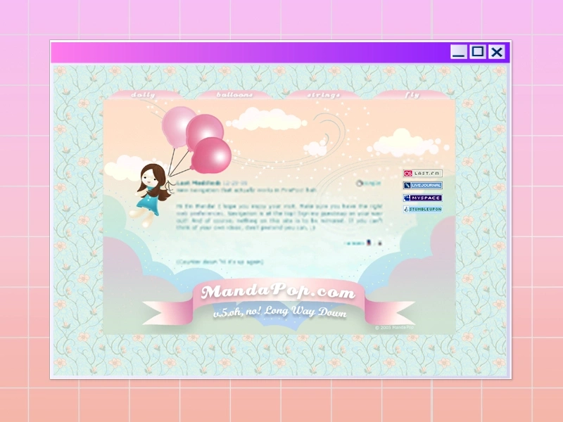
Here are some chronological iterations of MandaPop.com as well as my Blog & LiveJournal from 2002 to 2005:
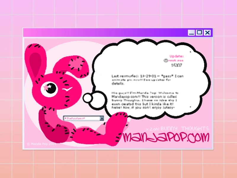
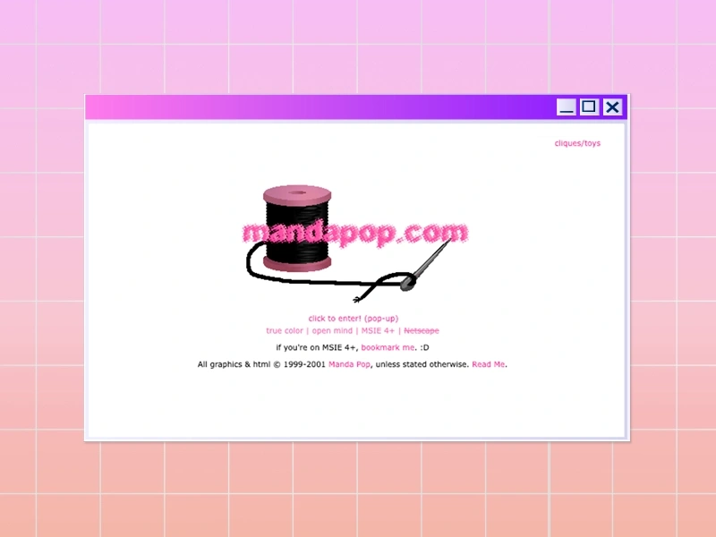 Splash page.


My Experience
How I Learned About Personal Sites
In the late 90s, I was a sheltered, angsty teen in rural Louisiana with a lot of free time. The internet was my window to the real world. In the “Wild West” days of the web, the only way to truly represent yourself online (beyond AOL chatrooms or message boards) was through a personal site. After a few months of building up my skills, I found a glittering community at the intersection of kawaii and kandi-kid culture that unabashedly and colorfully expressed themselves through personal sites. I was inspired with a new sense of belonging, and made it my entire personality.
Learning to Code
We were all self-taught, learning HTML, CSS, JS, and PHP through tutorials like Dodo’s or by chatting with more experienced friends on AOL Instant Messenger (AIM). This was how I mastered iFrames, dropdown navigation menus, image map hovers, and learned the nuances of web vs. print resolution, along with the indestructible value of vector graphics. This early exploration laid the groundwork for my design journey, long before college was even on my mind.
Important Figures
There were two popular creators that it felt like everyone looked up to at the time: Drew (P-Nut) of Love Revolution, who brought us all together with his message board, and Kimi (Kimikat) of Rainbowlicious, who inspired us with her unique aesthetic and skills. Amber (Cat*E) of Miseducated even has a tribute page for Kimi and their shared sites, which has a lot of nostalgic comments from oldschoolers over the years.
The Emergence of LiveJournal & MySpace
In 2002, LiveJournal became our new playground. Beyond oversharing and connecting through LJ Communities, paid users could customize their journals with code and upload custom “mood” graphics for each post, pushing our creativity within tight parameters.
MySpace emerged in 2004 as the first widely accessible personal site, allowing everyone to customize with code. Sadly, it was the last social network to permit this level of customization, marking the end of a era. As these new platforms took over, personal sites became obsolete.


Above: LJ Moods I created, inspired by kao-anis (shown later).
Present-Day Personal Sites
Amazingly, in recent years, there’s been a revival of personal sites, with oldschoolers returning to their roots and young creators figuring it all out. They’re making pixel art cuties, sharing 88x31 buttons, and building their own unique spaces online. Many even link to old sites like The Quilting Bee through the Wayback Machine, keeping its spirit alive.
This shift seems to reflect Gen Z’s growing pushback against smartphones and the way they hinder real human connection. It makes sense they’d turn to personal sites because it’s a much slower, more intentional space to express themselves and connect.
Some sites they use are Neocities (the new Geocities), and Spacehey (the new Myspace). I guess it wasn’t the end of an era after all!
Standard Practices
Basic Structure
Visiting a personal site back then often began with a splash page recommending the best browser and settings. After clicking “Enter,” visitors would arrive at an artful mosaic of iFrames, with an area reserved for actual content. Navigation was usually managed through a single, colorful dropdown menu, or an image map guiding visitors to pages filled with photos, favorite things, and personal reflections in the form of manual “blogs.”
Link Sharing, but Make it Cute
Much like trading friendship bracelets, we swapped site buttons and other forms of pixel art to show love and support to each other’s sites.
Buttons were created in standard sizes: 88x31 was most used for site buttons, but there were also 32x32 for friends/affiliates, 150x20 for blinkies, and 99x56 for stamps. They were arranged closely together like a big wall (see my 88x31 button wall below).
We also made tiny pixel art characters, lovingly known as “cuties,” which visitors could “adopt” into their own digital “toy boxes.” Check out this massive toy box from oldschooler Jessica (Ravey) of Moon Candy!
Another beloved form of link-sharing was the "fansign” — a personalized graphic gift, usually crafted by a friend or loyal fan, and proudly displayed like a badge of honor.
“We exchanged tiny pictures like friendship bracelets.”


")
")


")
")


")


")
")
")
")
")
")
")
")
")
")


Above: Behold my button wall! Top half: Oldschoolers;
Bottom half: The new wave!


")

")
")

")
")


")

")
")


")
")
")
")
")
")
")

Above: Cuties/Toys I collected. I made the top three rows.
Rings & Cliques
We also joined or maintained “web rings,” which were just link lists based on similar interests. There were also "web cliques," which functioned more like social groups, connecting websites with a shared themes. The most elite web clique in my cute community was the Quilting Bee (aka Q*Bee), where each member designed a 40x40 patch to represent their site. Trading these patches allowed us to build “quilts” of links to other personal sites! See below.


")


Above: Some Web Rings I was in.
“Each new layout felt like a fresh start”
Other Features
Personal sites often featured extras like online quizzes, simple arcade games (like Breakout or Pong), custom wallpapers, and a guestbook or even a guest map where visitors could leave messages and mark their general location. These additions made each visit interactive and personal.
The magic was in the constant reinvention. Each new layout felt like a fresh start, a chance to add features, test ideas, and express ourselves further.


Above: Kaoanis were a huge obsession. Tons more here.
Learn More
Chibilicious Nostalgia – More Y2K internet aesthetic goodness.
Web Design Museum – General education of the history of Web Design.
The Wayback Machine – Try your luck at finding archived websites from long ago!
Neocities – Start here if you’d like to express yourself with an analog website.
Spacehey – Represent yourself online the old way and connect with others!
Creative Foundations
The world of DIY personal sites is where I first learned to code, represent myself online, and connect with others through our shared love of design, rave culture, and pop culture. But I probably wouldn’t have found my way there without three formative pieces of technology: Video Painter, which introduced me to digital art and animation; Mario Paint, where I expanded those skills and started experimenting with music composition; and a Power Mac loaded with AOL, Photoshop, and Illustrator, which was the doorway that ultimately led me to web design.
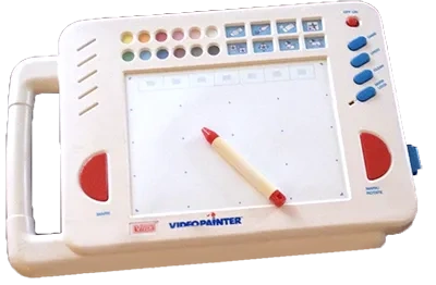
Video Painter (Early 90s)
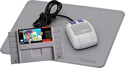
Mario Paint on Super Nintendo (1992)
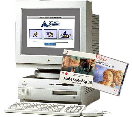
Power Mac with AOL, Photoshop, and Illustrator (1998)